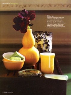
Image courtesy of Livingetc Magazine
I wanted to share this cool study in color & texture contrast that I stumbled upon in my magazine archives, from Livingetc (one of my favorite home design magazines out of the UK). Color is such an integral part of Paper Source– if you haven’t yet, check out our colorscope— and the vibrant yellow in this image reminds me of how our curry is a beautiful match for almost any deep purple. This particular vase with its glossy finish, set against the deep dark richness of the flower, and the highlights of its edges and velvety texture… all create a bounty of visual fun! Whether it’s a vase and flower combination like this, or a shirt and a scarf, or a card and envelope pairing…there are countless ways to mix this gorgeous color combo into your everyday life.
P.S. view the photo full-sized to get the full effect.
–Fabra
PS colors: gravel & chocolate
Latest fave: Teflon bone folder


I cannot agree more about how beautiful “curry” and deep purple look together. I’ve loved you Paper Source from the beginning, and I continue to keep on loving all of your products, ideas and inspirations. Thank you for bringing a valuable creative outlet! It was long overdue until you came along. :o)
What a great combo! Thanks for the suggestion.
gorgeous! thank you for sharing!